Art Fund
Support and engage with art in the UK
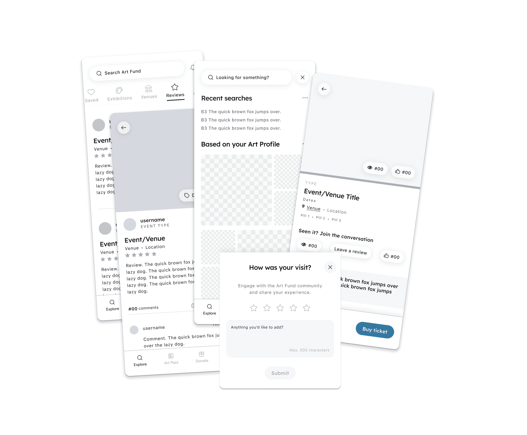
Event discovery
Mobile app
Case study
Designing a mobile app that provides users with information for cultural events in the UK. Users can also donate to support the promotion and preservation of cultural heritage.
This case study will show you some of the designs, and my thinking and research.
My role
Product design
User research
Visual design
Tools
Figma
Timeline
Nov - Dec 2024

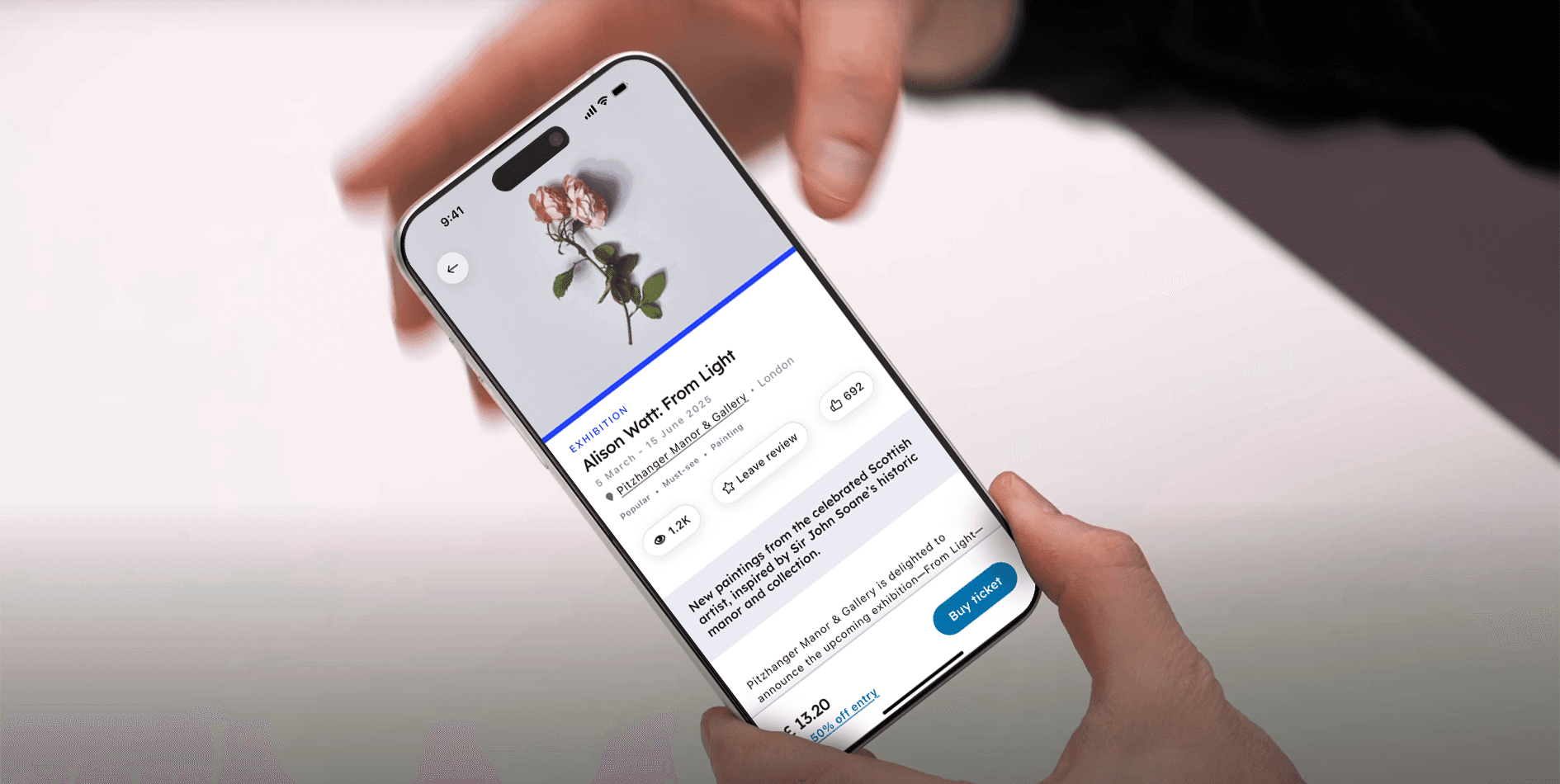
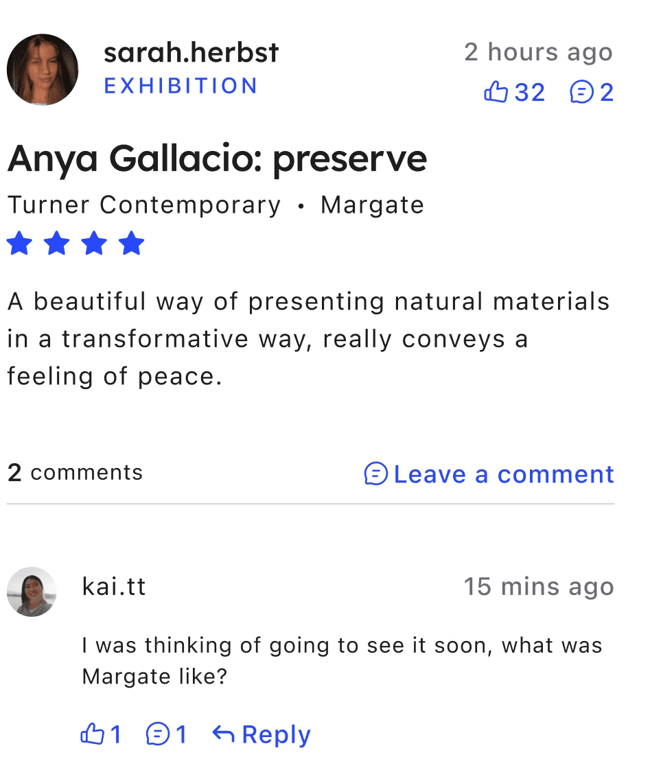
EXHIBITION
Alison Watt: From Light
5 March - 15 June 2025
Pitzhanger Manor & Gallery
•
London
Popular
•
Must-see
•
Painting
Seen it? Join the conversation
789
Leave a review
582
What others are saying >
New paintings from the celebrated Scottish artist, inspired by Sir John Soane’s historic manor and collection.
Pitzhanger Manor & Gallery is delighted to announce the upcoming exhibition—From Light—by the award-winning artist Alison Watt, running from 5 March to 1 June 2025. This will be Alison Watt’s first exhibition in a public gallery in London since 2008.
Visitor Information
Address
Pitzhanger Manor & Gallery
Ealing Green, London
Greater London, W5 5EQ
020 3985 8888
Opening times
Monday: Closed
(Bank Holidays: 10am–5pm)
Tuesday: Closed
Wednesday: 10am–5pm
Thursday: 10am–5pm
Friday: 10am–5pm
Saturday: 10am–5pm
Sunday: 10am–5pm
Get directions
Facilities
Public
transport
Great for
families
Accessible
facilities
Cafe
Shop
Talks and
courses
Temporary
exhibitions
Nearby

A
10% off in shop
EXHIBITION
Anthony Gormley: Another Time
19 August 2017 / 1 November 2026
Turner Contemporary
•
Margate

A
50% off entry
VENUE
Margate Caves
Margate
A
Free entry
EVENT TYPE
Event title
DD/MM/YYYY - DD/MM/YYYY
Insitution
•
Location
Get a National Art Pass to see more art and help museums across the UK.
National Art Pass offers available at National Gallery
£ 13.20
A
50% off entry
Buy ticket
9:41


At-a-glance
Context
Art Fund is a UK-based non-profit organisation dedicated to increasing access to the arts. It provides information on events and supports fundraising for the preservation and promotion of cultural heritage.

Problem
Website only
Art Fund users are without a mobile app platform, making it more difficult to find events, to donate and to use their membership perks on the go.
Solution
A mobile app
Provide event information and avenues for users to make donation, a reviewing system to better inform ticket purchase choices.

Recommended events
Just for you
The Art Fund app acts as a cultural discovery engine, recommending exhibitions and events based on your location, interests, and usage patterns. The more a user engages with the app, by saving events, reviewing exhibitions, or even browsing certain topics, the more refined the recommendations become.
By highlighting lesser-known institutions alongside headliners, the app enhances your cultural experience and supports the broader UK art scene.
Donate
Support culture
As a non-profit organisation, Art Fund benefits from their supporters donating to help support UK culture and heritage.
Fast
Users can make donations at a quicker pace with a mobile app, they simply need to pull their phone out from their pocket.
Informative
Within the app, users can read stories and learn about how their donations are helping.


A reviewing system
What did you think?
With a reviewing system, users can now not only learn more about what others are thinking events, but can engage with other users. Share your voice and let others know where you've been and what you've seen!
National Art Pass
Membership perks
If you are an Art Fund member, you can receive some great benefits.
Free or discounted entry
Members gain discounted or even free access to events, as well as discounts in museum shops.
Informative
Within the app, users can read stories and learn about how their donations are helping.
Support
Being a member supports the preservation of UK culture, your perks benefit the arts.

Explore
Art Pass
Donate
Profile
Secondary research
Cultural growth between 2022-24
Visitors
33% of the UK population
visit museums.
Engagement
89% of UK adults are
engaging in the arts.
Earnings
Art Fund have an estimated annual profit of £8m.
Impact
The cultural sector has an
annual impact of £1.5b.
Technology
11% increase in digital engagement in the UK.
Footfall
The annual population visiting an
average museum is 1m.
1/6
Anecdotal feedback was important, in order to take personal experiences with art platforms into account.
More and more people are making the most of the arts within the UK now that institutions have healed after the pandemic - a lot of which have received helped from Art Fund.
Survey Monkey was used to send out my questions, the participants were from creative industries, and associated with art and design. Their identities have been altered to preserve their anonymity.
0%
0%
purchase a ticket for a cultural event every month
0%
0%
are neutral in their satisfaction of their current art platforms
0%
0%
of participants would value trying a new app

Julia
A new UK citizen
The Pass is really good. I’m not from the UK so it’s really helpful for finding British exhibitions to visit and gets me out to new areas - but I still have to go through their site to find them rather than be given ideas.

A Reddit User
r/contemporaryart
It would be a good idea to have a reviewing system for users, but also allow institutions and the like to contribute.

Matt
An art enthusiast
I only really find out about exhibitions through posters on the underground on my way to work, or Instagram. But I don’t have a choice in what I am shown.
A Reddit User
r/contemporaryart
I think the main benefit of Art Fund is that it recommends people places outside of London and the other big cities […] the quieter places aren’t seen enough.

Ben
Enjoys art casually
I use Letterboxd a lot and find it useful […] Paying £25 on an exhibition ticket based on a random review online rather than a friend’s thoughts is very 50/50, whether I’ll like what I go to see.
A Reddit User
r/contemporaryart
I used to have one of those passes when I was a student, but it was an effort having to go through their site to find what exhibitions I could use it for.

Nicola
Museum staff
I can have my bank cards on my phone but not my Art Pass.
A Reddit User
r/contemporaryart
[...] and so strange that there are apps that allow people to share reviews for films or food, but not for the arts - there is space for one.
1/8
Competitive audit
Desired features amongst competitors
What users want
Recommendations
of events throughout the UK
Social elements
to communicate with other users
Discounts
on exhibition tickets
Reviews
provided by users and critics
What competitors offer

Event information
Discounts
Recommended Events
Social Elements
User Review System
Critic Reviews
Free to use

Event information
Discounts
Recommended Events
Social Elements
User Review System
Critic Reviews
Free to use

Event information
Discounts
Recommended Events
Social Elements
User Review System
Critic Reviews
Free to use


Event information
Discounts
Recommended Events
Social Elements
User Review System
Critic Reviews
Free to use

Event information
Discounts
Recommended Events
Social Elements
User Review System
Critic Reviews
Free to use
What they say
The Art Fund service is great in theory, but they need recommendations and clarity on venue amenities.
What they think
Entry to exhibitions can be quite expensive, and most of the time they are informed of them through chance. A community for discussion would help.
What they do
If they have a membership, they use it through the website. They usually purchase tickets via peer review, or after finding an event during a commute.
How they feel
Uninformed. Frustrated. Hopeful.
Pain points
Where can I go?
Struggling to know what their Art Passes are eligible for.
Mobile pass
They don't want the hassle of having a physical card.
What can I do?
They need to find out more about amenities within the institutions they visit.
Needs
Just for you
Clear suggestions and filtering.
You'll like this one
To find cultural events within the UK that align with their interests.
What others think
An effective review system.
Obstacles
Problems
Hypothesis
An efficient reviewing system
Suggestions based on chosen preferences
Users find events based
on chance
The process takes
too long
Platforms inefficiently
suggesting events
Using multiple sources
for objective
Ideation
Building from the ground up
Explore
Profile
Donate
Art Pass
The card
Purchasing options
Expiry date
Offers
About Art Fund
Make a donation
Advocacy information
Art Fund people
Profile details
Settings
Followed/following
FAQ's
Recommended events
Search/filter
Review feed
Saved items
Information architecture helped organise the different features that would be used in the product and begin formulating an ideal blueprint.
User flows were formed to create paths for the blueprint, in which the user would complete their objective.

User flow diagram (Explore)
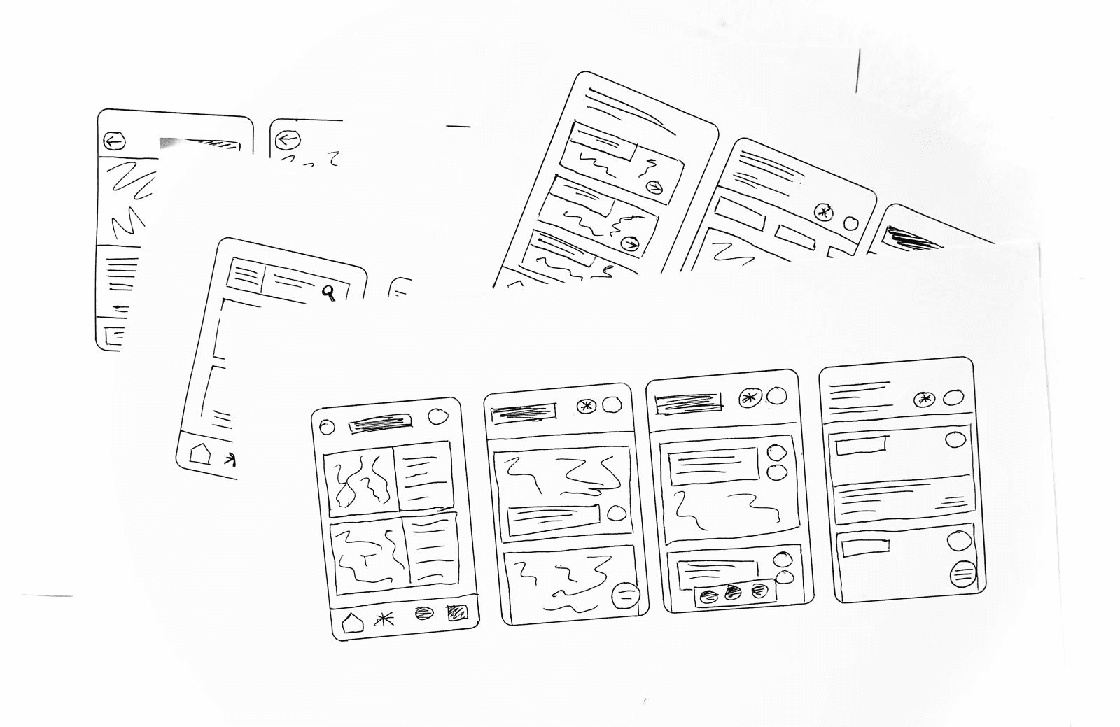
I began my physical visualisation with rapid sketching, using Crazy 8's to generate ideas - these ideas help build structures for the IA blueprints. This were then iterated upon heavily in Figma, with user feedback.
I then proposed a task to a user - using a rough prototype, find a review for an event. Once completed they reverted with feedback on what they felt could be improved.

Matt
An art enthusiast
Use bigger text for the buttons.

Nicola
Museum staff
[..] a more efficient way to find reviews for a specific event, is when the user searches for it, it comes up with the event but also gives them the option to look at the reviews already out there.

Julia
A new UK citizen
The buttons could be a little more noticeable […] even though it was one of the first things on the exhibition's screen, it wasn't immediately obvious where it was.
Colour palette
Art Fund has a varying colour palette within their website, which needed to be reduced in order to create a more cohesive user experience, whilst meeting WCAG standards for accessibility.
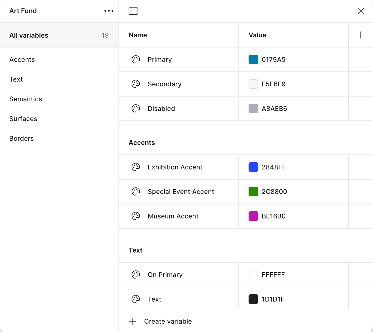
Contemporary
An understated palette gives a modern feel that lets the content speak for itself.
Accessible
Categorising items using colours used in Art Fund's branding, makes the content easier for users to engage with.
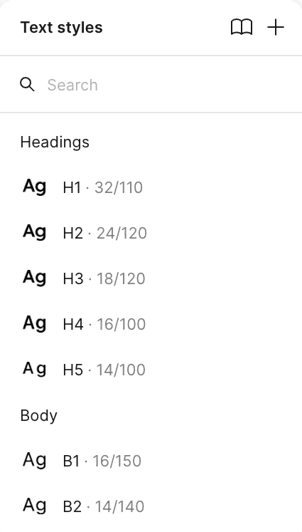
Typography
Lexend Deca is a font that combines soft curves in lettering, with a sharp point, it is similar to many others found it art establishments like galleries and museums with a post-modern aesthetic.
SF Pro Text is used for the body text, for no other reason than its straight-forward readability.
H2 - subheadings
Support the people who make our museums
Component library
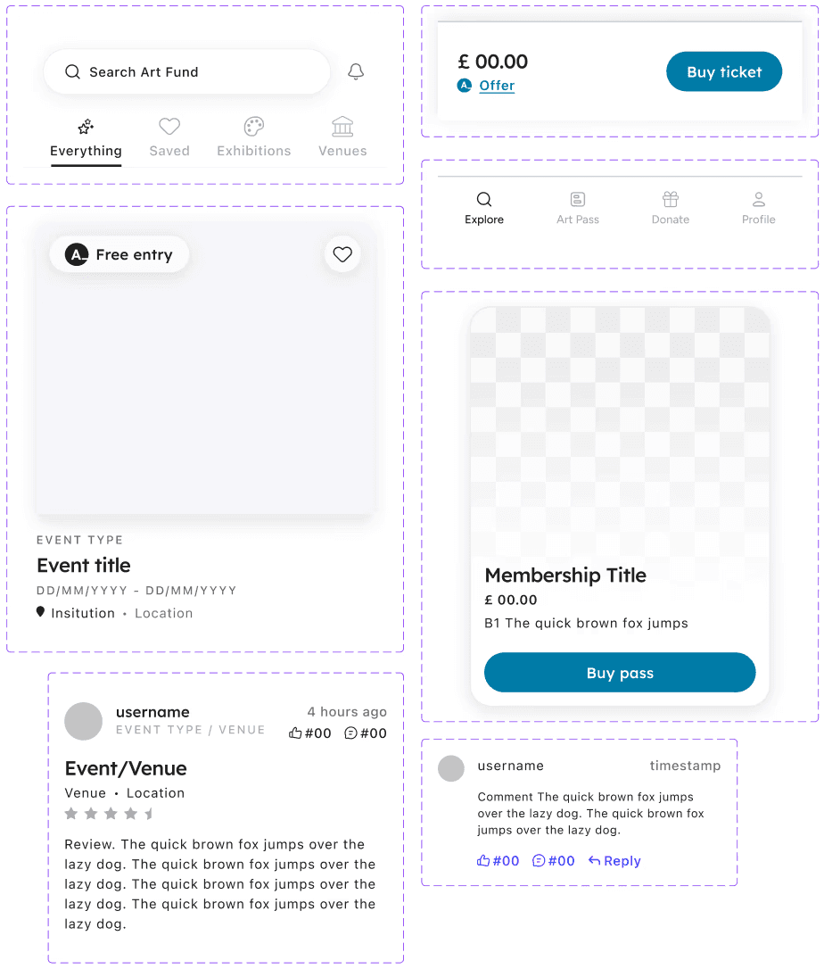
Icons and the general set-up of what was required for the user experience, was taken from the Art Fund website. However, certain things were changed.
Now a reviewing system has been implemented, I altered the 'save for later' icon to a heart rather than a star, so the star can be used for user reviews.
Item cards were revised, to remove any unnecessary 'overdesign' that could remove attention from the items.